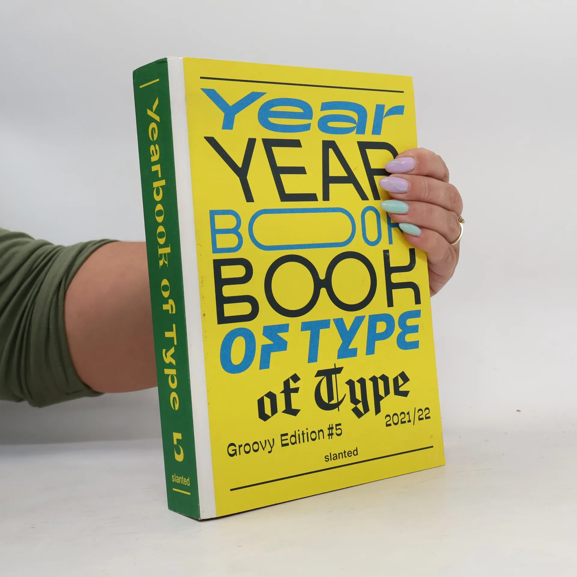
You know the scenario: searching for a fitting series or movie on your streaming platform can lead to endless doom-scrolling without finding what you want. The same frustration occurs when seeking the perfect typeface for your design—one that captures the desired mood while meeting all requirements. With countless browser tabs, bookmarks, and folders, locating the right typeface and foundry becomes a challenge. This collection showcases the latest published typefaces, making it easier to find the ideal one. You can browse through the book or quickly consult the index, which organizes typefaces by class, designers, and foundries. Each font and font family is displayed across double pages. The left page features the font applied, inspired by this year’s theme of film and drama, while the right page provides detailed descriptions, highlighting features and information about the designers and foundries. An accompanying online microsite offers direct links to foundries and purchasing options for all fonts. Additionally, the publication includes essays, interviews, and tutorials on type design and contemporary typography. This resource brings clarity to the overwhelming world of streaming and browsing, helping you discover the typefaces you need—and perhaps even the perfect movie for the evening!
Lars Harmsen Knihy


Support Independent Type
- 296 stránek
- 11 hodin čtení
"Support Independent Type is a book about the new culture of type specimens, their impact on design and typographic culture at large. It's a manifesto for independent type foundries showcasing their work in an effort to promote freshly designed fonts, and why we should support them. An exhibit of over 400 of today's most adventurous typography labels and designers, showcasing their physical and digital type specimens! The carefully selected collection gives a glimpse into the adventurous shift of this creative industry. The authors believe that "independent type design reflects culture in its ambition to build an exciting alternative to the monolithic corporate font giants. In that spirit, we put together a collection of the most trendsetting, forward-thinking and provocative type specimens produced in the last decade." -- publisher website
Versus_
- 216 stránek
- 8 hodin čtení
In VERSUS_ werden 70 Schriftarten des Karlsruher Gestaltungsbüros MAGMA zusammen mit Bildern des Fotografen Christian Ernst in umfangreichen Anwendungsbeispielen vorgestellt. Wie der Name andeutet bietet das Buch eine eindrucksvolle Gegenüberstellung von Typografie (FTS=Fonts) und Bild (Pix=Pictures). Mit VERSUS_ erhalten Leser einen ausführlichen Fontkatalog inklusive diverser digitaler Schriftarten, inspirierender Anwendungen und spielerischer Fotografien, gebunden in Kunststoff zu einem attraktiven Preis
Bastard Choose My Identity
- 396 stránek
- 14 hodin čtení
¿Qué ocurre cuando el mundo de convierte en una ciudad global, cuando las culturas se mezclan, se disuelven las tradiciones y surge algo nuevo? En su búsqueda de la identidad y el “bastardeo” cultural, los autores visitan los puntos calientes de la globalizació Ciudad de México, Los Ángeles, Tokio, Hong Kong, Bangkok, Dubai y de vuelta a Frankfurt, reuniéndose con artistas, músicos, diseñadores y escritores.
The choice of a typeface and the design of a text can have a dramatic impact on its meaning. Typefaces don?t need words to convey a message. The responsibility for graphic designers in choosing the right typeface is therefore crucial. But how do you find the right typeface in the infinite universe of possibilities? The Yearbook of Type 2021/22 makes it easy to get an overview of recently published typefaces from around the world while understanding their visual language.00Each typeface is presented on a double-page spread. On the left side, a specimen gives an idea of possible applications and shows the beauty and character of each typeface. This year?s theme is music. As music conveys emotions through melodies and lyrics, typography does so through its form and balance of letters. The right page provides detailed information about the designers and foundries, as well as an overview of the typefaces? features.00The Yearbook of Type is complemented by a series of essays that offer background information about typography, history, technical details and how-to guides, and the latest trends in current type design. An index sorts typefaces by classifications, besides listing designers, foundries, and OpenType features. Last but not least, an online microsite presents all featured fonts, so that users can test or purchase them.
Film Festival Cologne- Die Macht der Bilder Vol. 2
- 176 stránek
- 7 hodin čtení
Das Film Festival Cologne ist eines der führenden Festivals in Deutschland und ein wichtiges internationales Branchenevent. Es präsentiert weltweite Trends und zeigt herausragende Arbeiten audiovisuellen Erzählens zum ersten Mal in Deutschland. »FFCGN - Die Macht der Bilder Vol. 2« begleitet das Festival visuell als auch mit Texten und Überlegungen zur Vielfalt der medialen Kultur und trägt ausgewählte Inhalte aus der aktuellen Filmwelt zusammen.Alles über die Macht der Bilder in Film, Popkultur, Kunst und Gesellschaft. Beim FILM FESTIVAL COLOGNE vor Ort oder in diesem reich bebilderten Band.