
Miláček čtenářů je právě vyprodaný


Parametry
- 153 stránek
- 6 hodin čtení
Více o knize
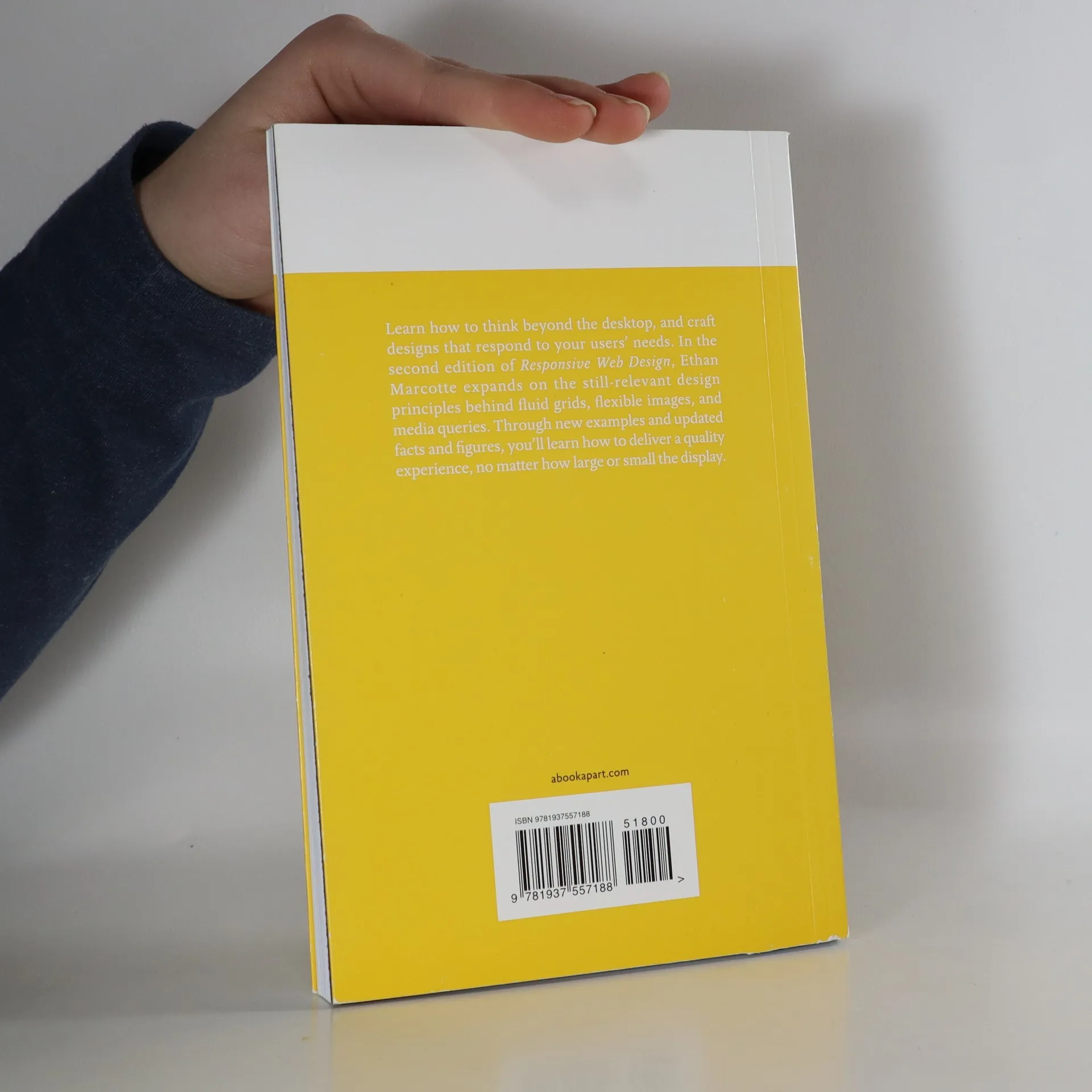
Learn how to think beyond the desktop, and craft designs that respond to your users’ needs. In the second edition of Responsive Web Design, Ethan Marcotte expands on the still-relevant design principles behind fluid grids, flexible images, and media queries. Through new examples and updated facts and figures, you'll learn how to deliver a quality experience, no matter how large or small the display.


Nákup knihy
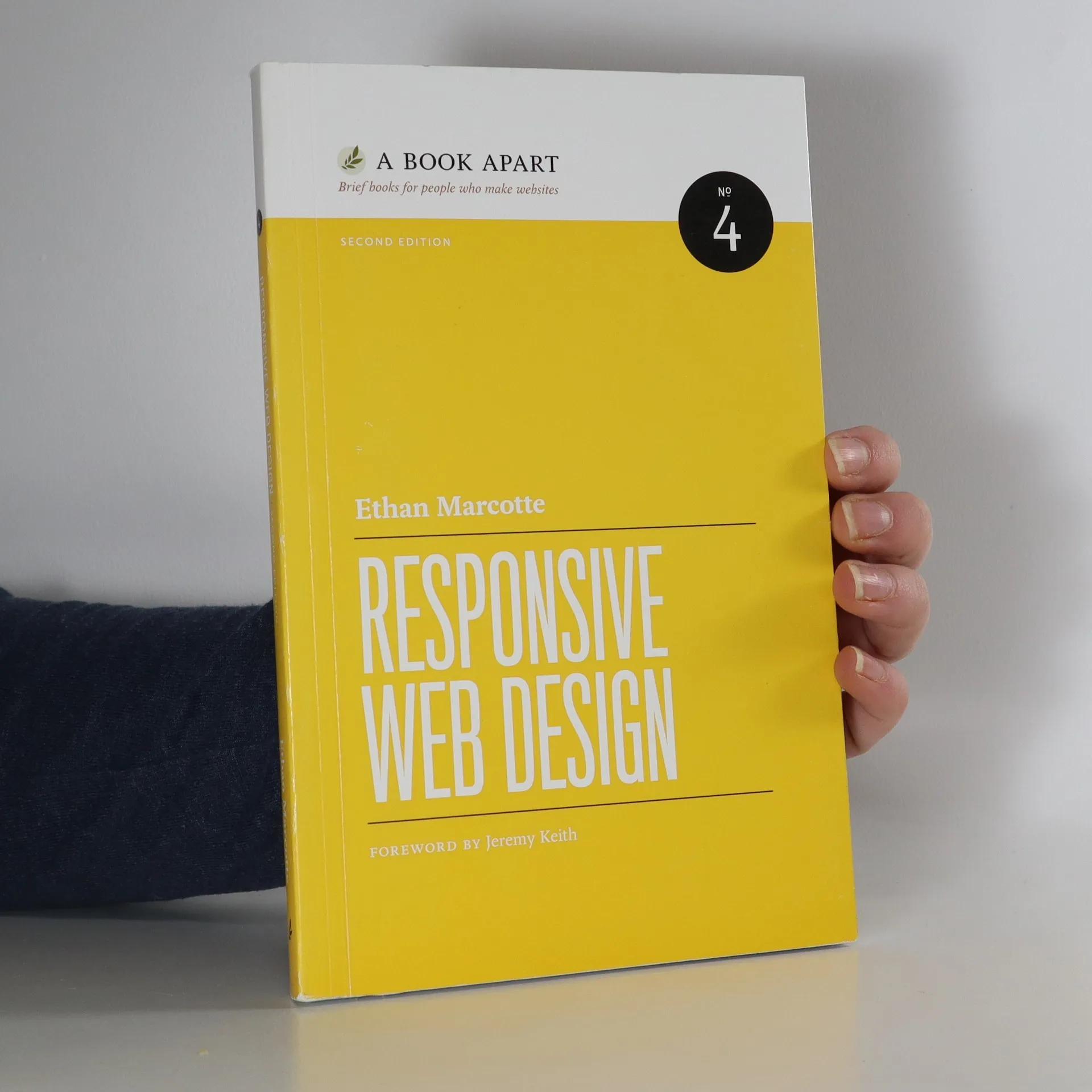
Responsive Web Design, Ethan Marcotte
- Jazyk

- Rok vydání
- 2014
- product-detail.submit-box.info.binding
- (měkká)
Jakmile se objeví, pošleme e-mail.
Doručení
Platební metody
Tady nám chybí tvá recenze.
- Jazyk
- anglicky
- Autoři
- Ethan Marcotte
- Rok vydání
- 2014
- Vazba
- měkká
- Počet stran
- 153
- ISBN10
- 1937557189
- ISBN13
- 9781937557188
- Série
- Štítky
- Naučná literatura, Umění & Kultura, Technologie & Průmysl, Počítače & Internet, Technologie, Design
- Hodnocení
- 4,15 z 5
- Anotace
- Learn how to think beyond the desktop, and craft designs that respond to your users’ needs. In the second edition of Responsive Web Design, Ethan Marcotte expands on the still-relevant design principles behind fluid grids, flexible images, and media queries. Through new examples and updated facts and figures, you'll learn how to deliver a quality experience, no matter how large or small the display.